Another Christmas card, this time with a stamped background of snowflakes (Penny Black) and the tag made with stamps from My Paper World.
This one is for
http://pennybfriendssaturdaychallenge.blogspot.com/ PB backgrounds
http://bearlymine-challenges.blogspot.com/ tags
http://aspoonfullofsugarchallenge.blogspot.com/ tags
'tagging'
Saturday, July 30, 2011 Posted by R3ank at 6:57 PM 0 comments
This is the first of some tags I have been making. I used distress inks for the background and then edged it with gold paint. The wee stamp is by Magenta. I restamped the cat on to plain paper and glued him over the image. Finished off with a circle cut from a gold doyley, and a decorative button.
I would like to enter the following challenges.
http://bearlymine-challenges.blogspot.com/ 'use a tag'
http://aspoonfullofsugarchallenge.blogspot.com/ 'tags'
http://stampinfortheweekend.blogspot.com/ anything with 4 legs
I would like to enter the following challenges.
http://bearlymine-challenges.blogspot.com/ 'use a tag'
http://aspoonfullofsugarchallenge.blogspot.com/ 'tags'
http://stampinfortheweekend.blogspot.com/ anything with 4 legs
Goodbye, Google Friends!
Posted by R3ank at 6:35 AM 0 comments
Google Friends is Google's monthly newsletter that included the latest announcements and product releases. 13 years after the first newsletter issue, Google announced that Google Friends will be retired.
Google Friends started as an eGroups mailing list, then it became a Yahoo Group and was later moved to Google Groups. "We used the company eGroups to mass-mail our Google Friends newsletter to users, because Larry's brother, Carl, was one of eGroups founders. Larry had done the configuration for the original eGroups server himself, and for a while the company's computational heart has lived under his desk. The same week we announced our deal with Yahoo, Yahoo announced they were buying eGroups for $428 million (Yahoo has been very kind to the Page family)," remembers the former Google marketing director Douglas Edwards.
The early issues of the newsletter include a geek-friendly changelog of Google's search engine. You'll find about the long-gone operator flink: (forward links), the PageRank bar displayed next to each search result and Google's plans to "have a much bigger index than our current 24 million pages".
"After combining our web server and search engine for better performance, we have been experiencing intermittent problems with our system being down for short amounts of time fairly frequently. If you have trouble getting to the system, try back in a minute or two, and it should be back up." (July 1998)
This is a paragraph you'll never find in a Google blog post, Twitter message or a recent Google Friends issue.
{ Thanks, Tomi. }
It's hard to believe, but this monthly missive is now 13 years old. We hope you've enjoyed reading it over time, and wanted you to know that we are retiring it in its current form.
As you may know, the Google Friends Newsletter was created by Larry Page in April 1998, when Google was still on Stanford servers. In the early days, the Friends notes offered newsy details like "We are gearing up to do another crawl. We should start within a few weeks" and tips on tweaking your search queries.
Obviously a lot has happened since then, including changes in how we communicate updates to all of you. So this will be our last Google Friends Newsletter. We started the Official Google Blog in 2004 and joined Twitter in 2009, and we've seen dramatic growth on those channels. Meanwhile, the number of subscribers to this newsletter has remained flat, so we've concluded that this format is no longer the best way for us to get the word out about new Google products and services.
Google Friends started as an eGroups mailing list, then it became a Yahoo Group and was later moved to Google Groups. "We used the company eGroups to mass-mail our Google Friends newsletter to users, because Larry's brother, Carl, was one of eGroups founders. Larry had done the configuration for the original eGroups server himself, and for a while the company's computational heart has lived under his desk. The same week we announced our deal with Yahoo, Yahoo announced they were buying eGroups for $428 million (Yahoo has been very kind to the Page family)," remembers the former Google marketing director Douglas Edwards.
The early issues of the newsletter include a geek-friendly changelog of Google's search engine. You'll find about the long-gone operator flink: (forward links), the PageRank bar displayed next to each search result and Google's plans to "have a much bigger index than our current 24 million pages".
"After combining our web server and search engine for better performance, we have been experiencing intermittent problems with our system being down for short amounts of time fairly frequently. If you have trouble getting to the system, try back in a minute or two, and it should be back up." (July 1998)
This is a paragraph you'll never find in a Google blog post, Twitter message or a recent Google Friends issue.
{ Thanks, Tomi. }
Templates for Google Contacts
Posted by R3ank at 5:55 AM 0 comments
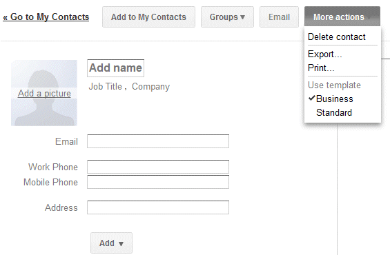
Gmail added a new feature that makes it easier to add a new contact: templates. If you click "More actions" when you create a contact or edit an existing one, you can select the business template to quickly add fields for the job title, company name, mobile phone and work phone.
The default template is more generic:
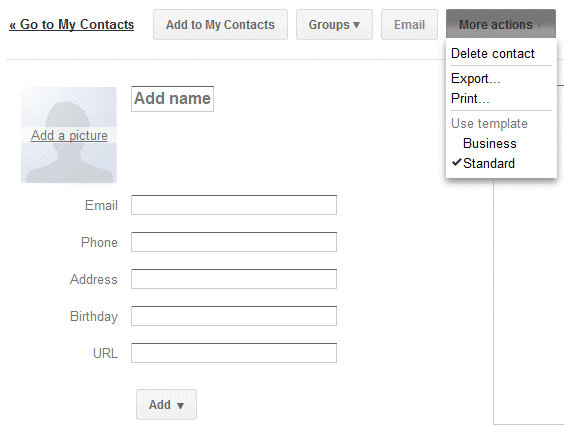
Google Contacts lets you add or delete fields, but you can't delete the fields from a template. Hopefully, Google will allow users to create custom templates and import some of the data from Google Profiles.
{ Thanks, Herin. }

The default template is more generic:

Google Contacts lets you add or delete fields, but you can't delete the fields from a template. Hopefully, Google will allow users to create custom templates and import some of the data from Google Profiles.
{ Thanks, Herin. }
Google Related
Posted by R3ank at 3:33 AM 0 comments
Google Toolbar 7.1 for Internet Explorer has a new feature that shows Web pages, news articles, places, images and videos related to the current page. The feature is called Google Related and it's a bar displayed at the bottom of the page.
"Google Related is a browsing assistant that offers interesting and useful content while you are browsing the web. For instance, if you're browsing a page about a restaurant in San Francisco, Google Related will assist you by displaying useful information about this restaurant such as the location of the restaurant on a map, user reviews, related restaurants in the area, and other webpages related to San Francisco restaurants - all in one place," explains Google.
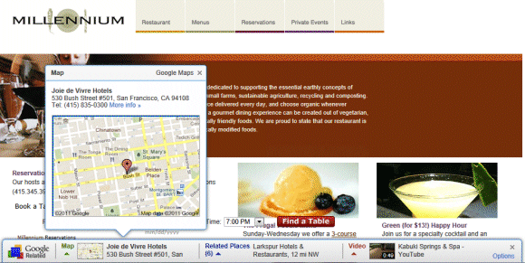
If you go to the Wikipedia article about Adele, Google Related shows 5 YouTube videos, 5 articles from Google News and 5 pages from Google Search.

Google Related is another feature that requires sending the list of all the pages you visit to Google's servers. To find related pages, Google needs to know the URL of the page you're visiting. The so-called "enhanced features" (PageRank, SideWiki, Google Related) send Google a lot of useful data. One of the most interesting ways to use the data is a feature that shows if a site is slow. Like all the other Google Toolbar "enhanced features", Google Related can be disabled from the "Options" dialog by clicking the "Privacy" tab.
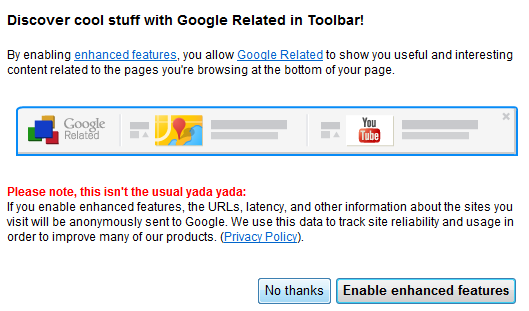
Apparently, Google Related only works if you've configured the toolbar's search site to be Google.com (United States of America - .com), so you may need to change this setting to enable Google Related.
"Google Related is a browsing assistant that offers interesting and useful content while you are browsing the web. For instance, if you're browsing a page about a restaurant in San Francisco, Google Related will assist you by displaying useful information about this restaurant such as the location of the restaurant on a map, user reviews, related restaurants in the area, and other webpages related to San Francisco restaurants - all in one place," explains Google.

If you go to the Wikipedia article about Adele, Google Related shows 5 YouTube videos, 5 articles from Google News and 5 pages from Google Search.

Google Related is another feature that requires sending the list of all the pages you visit to Google's servers. To find related pages, Google needs to know the URL of the page you're visiting. The so-called "enhanced features" (PageRank, SideWiki, Google Related) send Google a lot of useful data. One of the most interesting ways to use the data is a feature that shows if a site is slow. Like all the other Google Toolbar "enhanced features", Google Related can be disabled from the "Options" dialog by clicking the "Privacy" tab.

Apparently, Google Related only works if you've configured the toolbar's search site to be Google.com (United States of America - .com), so you may need to change this setting to enable Google Related.
Microsoft's Gmail Man Ad
Friday, July 29, 2011 Posted by R3ank at 1:01 PM 0 comments
Mary-Jo Foley found a Microsoft ad that tries to convince businesses to choose Office 365 instead of Google Apps because Gmail shows targeted ads. Microsoft created a character called Gmail Man, a postman that doesn't care about people's privacy and reads their messages to find related ads.
The irony is that the paid version of Google Apps doesn't show ads, even though administrators can choose to enable them. I thought that the whole "Gmail reads my mail" myth was debunked back in 2004 and people realized that online email services already used algorithms to index messages and to find spam.
"It was a fascinating angle in 2005 while Gmail was still new and under all kinds of scrutiny, but today, who cares that your emails are automatically scanned, really? Even before Gmail, ISP's already had the ability to read all your emails, but it has never really stopped anyone from using the email service of their choice," thinks Cédric Beust, a former Googler.
{ via Daring Fireball }
New Interface for Google Books
Posted by R3ank at 12:06 PM 0 comments
Google Books is the latest Google service with an updated interface that's cleaner and more consistent. Unfortunately, this means there's more white space and less space for books. For example, on a 800x600 resolution almost two thirds of the screen are used for navigation elements. Even if you click the "full screen" button, Google still displays the navigation bar, the search box and the toolbar buttons, while hiding the sidebar and the book's title.
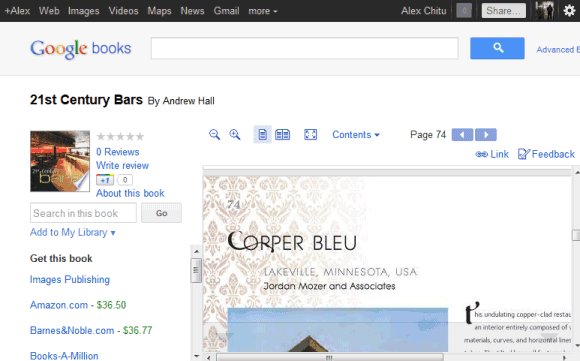
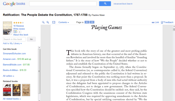
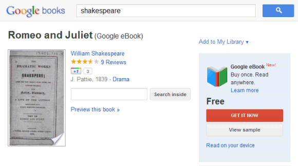
It's clear that the new Google+ interface is not suitable for all Google services and consistency sometimes makes Google's tools less useful. Displaying the navigation bar and the search box takes away valuable space and this is especially noticeable if you use a netbook. The new interface is not flexible or elastic, like Google intended. "The new design will soon allow you to seamlessly transition from one device to another and have a consistent visual experience. We aim to bring you this flexibility without sacrificing style or usefulness," explained Google. It seems that the new design sacrifices usefulness for the sake of consistency.
{ Thanks, Kon Young. }
Gmail's Auto-Forwarding Notice
Posted by R3ank at 8:45 AM 0 comments
Google decided to show a pink bar which informs Gmail users that their messages are automatically forwarded to another email address. The annoying "you are forwarding your email to ..." is displayed for about 3 minutes every time you open Gmail this week.

The explanation for this temporary annoyance is that some malicious software or other people who gain access to your account can setup auto-forwarding. "For about a week, this notice will appear for a few minutes each time you sign in to your account. Displaying the notification in this way helps ensure that you have a chance to see the notice, rather than someone who might try to gain unauthorized access to your account and use this setting improperly. The notice will disappear immediately if you choose to disable the forwarding setting, but that decision is up to you," mentions Google.
So that's the reason why there's no "dismiss" link and you're forced to see the pink bar again and again. Maybe it would be more useful to show this message for one week after auto-forwarding has been setup.
If you no longer want to see the message, temporarily disable auto-forwarding, switch to the simplified HTML interface or pin the Gmail tab if you use Chrome, Firefox or Opera. Another option is to add this filter in AdBlock Plus: mail.google.com##.fVKDI (the extension is available for Firefox and Chrome).
Wedding Anniversary
Posted by R3ank at 7:16 AM 0 comments
Just about reached the end of July, Summer fast coming to an end, well it's never really got going up here, been so cold over the last week apart from one good day. Heating back on and today I'm sitting here with a thick woolly cardigan on, what on earth am I going to do when Winter comes I do not know!! Least I think the in crafting mode has returned and hope it's here to stay. Why I leave
Google's Tablet-Optimized Interface
Posted by R3ank at 6:10 AM 0 comments
Google's services don't usually have interfaces optimized for tablets. They either use the desktop version (Google Search) or use the mobile version (Google Calendar, Google Docs). An important exception is Gmail, which started to test a tablet UI shortly after iPad's launch.
Google tests a new homepage and a new search interface for tablets. Unlike the standard desktop version, the new UI places the navigation menu and the search options sidebar at the top of the page, so that the search results take up most of the space.
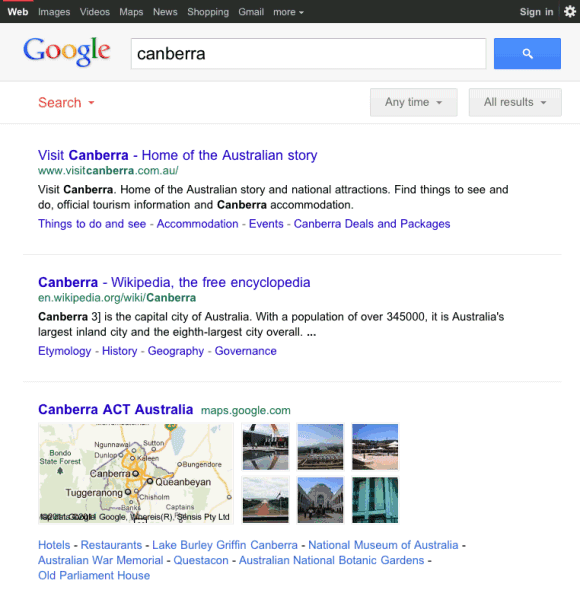
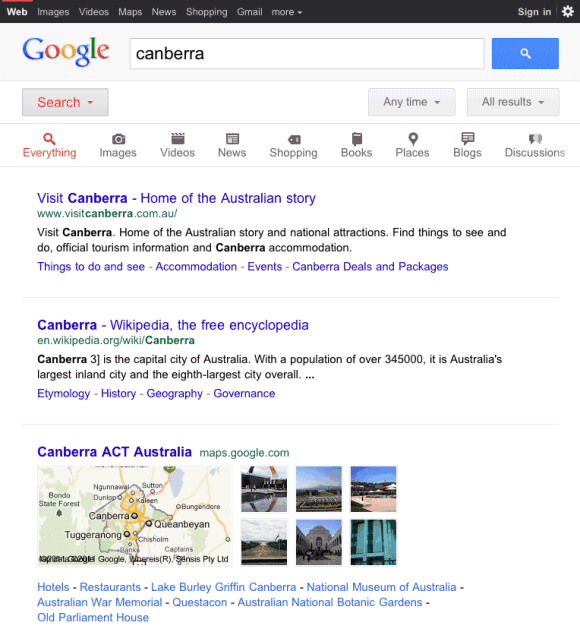
Amit Agarwal, who first spotted the experimental design, says that it's cleaner. "The new Google design uses a single column layout, while the old sidebar options appear between the search box and the search results. There's plenty of whitespace between search results and links to the Cached version of pages have been removed in the new design."
The new layout is more readable and it's also used for specialized search engines like Google Image Search and Google News. Google Image Search for iPad now uses infinite scrolling and shows a lot more results. Unfortunately, the list of missing feature is impressive: no Google Instant or Google Suggest, no links to the cached pages or to the mobile transcoder, no link to the advanced search page.
I've only seen the experimental UI in iPad's mobile Safari, but I'm sure that it should also be available for Android tablets like Motorola Xoom, Samsung Galaxy Tab 10.1 or Asus Eee Pad Transformer. Clearing browser's cookies might help.
Update: Google Mobile blog informs that the new UI "is rolling out in the coming days to iPad and Android 3.1+ tablets across 36 languages."
{ Thanks, Mushaf. }
Google tests a new homepage and a new search interface for tablets. Unlike the standard desktop version, the new UI places the navigation menu and the search options sidebar at the top of the page, so that the search results take up most of the space.


Amit Agarwal, who first spotted the experimental design, says that it's cleaner. "The new Google design uses a single column layout, while the old sidebar options appear between the search box and the search results. There's plenty of whitespace between search results and links to the Cached version of pages have been removed in the new design."
The new layout is more readable and it's also used for specialized search engines like Google Image Search and Google News. Google Image Search for iPad now uses infinite scrolling and shows a lot more results. Unfortunately, the list of missing feature is impressive: no Google Instant or Google Suggest, no links to the cached pages or to the mobile transcoder, no link to the advanced search page.
I've only seen the experimental UI in iPad's mobile Safari, but I'm sure that it should also be available for Android tablets like Motorola Xoom, Samsung Galaxy Tab 10.1 or Asus Eee Pad Transformer. Clearing browser's cookies might help.
Update: Google Mobile blog informs that the new UI "is rolling out in the coming days to iPad and Android 3.1+ tablets across 36 languages."
{ Thanks, Mushaf. }
Google Hotel Finder
Posted by R3ank at 5:31 AM 0 comments
Google launched an experimental service that would've been perfect for Google Labs: Hotel Finder. The service lets you find a hotel in US and it has a few clever features that make it stand out.
You can add shapes to the map to restrict the list of results to your favorite areas. Google highlights the most popular areas to help you. By default, Google creates a shape based on the most popular places.
Using shapes to filter results is not an original feature, but it's useful and it's surprising to see that Google Maps didn't add it.
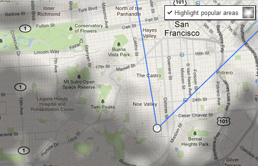
After selecting the location, Google lets you pick the check in and check out dates, choose a price range, a hotel class and restrict the results to hotels that have great user ratings.
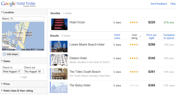
Another cool feature is that the results can be expanded inline so you don't have to open a new page to see some photos and read the reviews. Add the hotels you like to a "shortlist" to quickly compare them.
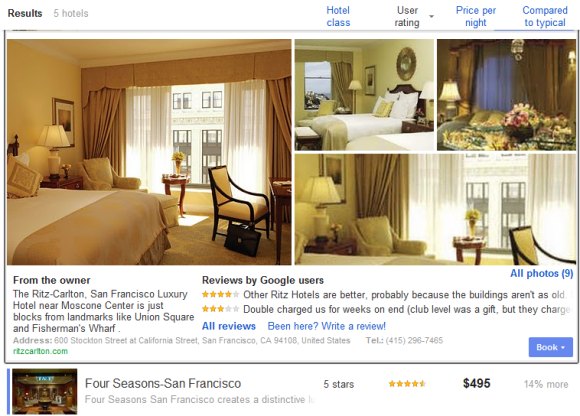
Google Hotel Finder is also useful to find great deals. The "compared to typical" section offers some information that's not easy to find by comparing the current prices with the historical averages.
Unfortunately, you can't book hotels using Google's service, at least not directly. Google Hotel Finder sends you to sites like Booking.com, Priceline, Expedia, Travelocity.
For now, Google Hotel Finder only works for US hotels, but it's a surprisingly strong offering. While there are many features that need to be added to compete with Bing Travel, Google's service is really promising. It's fast, easy to enough and offers helpful information that's not available elsewhere.
You can add shapes to the map to restrict the list of results to your favorite areas. Google highlights the most popular areas to help you. By default, Google creates a shape based on the most popular places.
Using shapes to filter results is not an original feature, but it's useful and it's surprising to see that Google Maps didn't add it.

After selecting the location, Google lets you pick the check in and check out dates, choose a price range, a hotel class and restrict the results to hotels that have great user ratings.

Another cool feature is that the results can be expanded inline so you don't have to open a new page to see some photos and read the reviews. Add the hotels you like to a "shortlist" to quickly compare them.

Google Hotel Finder is also useful to find great deals. The "compared to typical" section offers some information that's not easy to find by comparing the current prices with the historical averages.
Unfortunately, you can't book hotels using Google's service, at least not directly. Google Hotel Finder sends you to sites like Booking.com, Priceline, Expedia, Travelocity.
For now, Google Hotel Finder only works for US hotels, but it's a surprisingly strong offering. While there are many features that need to be added to compete with Bing Travel, Google's service is really promising. It's fast, easy to enough and offers helpful information that's not available elsewhere.
Oregon pictures
Tuesday, July 26, 2011 Posted by R3ank at 9:31 PM 0 comments
Here is a whole sh-pill of pictures from our recent Oregon trip. It was so memorable and we had so much fun seeing everyone! Every single one of us Rampton kids now live in a different state. We have the entire US covered (Washington, Ohio, North Carolina, Utah, Arkansas, Arizona), so it really was a treat to all be back together again.
Here are pictures of the individual families that make up my big family:
North Carolina Ramptons:
Beautiful Becca and Eliza:

The Utah Halversons:

The Ohio Phillips:

8 year old Abby who just got baptized:
The Washington Egberts:
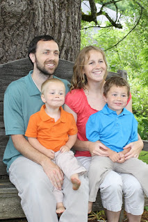

Us Arkansan Fowlers:
(don't you just love Johnny's face above?)

Newlywed Arizona Ramptons:


And last but not least, good ol' Oregon Mom and Dad:

We ventured off to the beach:
We had such a fun time at DaVinci days:
Tons of hands on things for the kids to do and touch:


There was a really cool kinetic sculpture parade. Everything was powered by humans (nothing powered by motors)
Our group watching the parade go by:
This guy was so cool. He was on stilts and could even jump rope:
James actually felt short for once in his life:

This guy was a master of hula hooping. He even hula hooped with a huge tractor tire!
We got to see my 102 year old Grandma Bear:
Beautiful as ever:
The cousins all got together, including the quints (the 5 Rampton grandkids born in 2007):
Lots of fun memories made at Tutu and Gumpa's beautiful house:


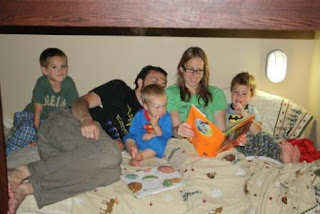
 The line for the swing (the hottest attraction at the reception):
Here are pictures of the individual families that make up my big family:
North Carolina Ramptons:
Beautiful Becca and Eliza:

The Utah Halversons:

The Ohio Phillips:

8 year old Abby who just got baptized:
The Washington Egberts:


Us Arkansan Fowlers:
(don't you just love Johnny's face above?)

Newlywed Arizona Ramptons:


And last but not least, good ol' Oregon Mom and Dad:

We ventured off to the beach:
We had such a fun time at DaVinci days:
Tons of hands on things for the kids to do and touch:


There was a really cool kinetic sculpture parade. Everything was powered by humans (nothing powered by motors)
Our group watching the parade go by:
This guy was so cool. He was on stilts and could even jump rope:
James actually felt short for once in his life:

This guy was a master of hula hooping. He even hula hooped with a huge tractor tire!
We got to see my 102 year old Grandma Bear:
Beautiful as ever:
The cousins all got together, including the quints (the 5 Rampton grandkids born in 2007):
Lots of fun memories made at Tutu and Gumpa's beautiful house:


A delicious dinner out to American Dream Pizza with the family. Here's a picture of the "kid table":
And of course the reception:

Subscribe to:
Comments (Atom)


