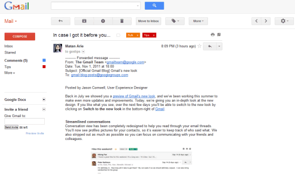
Gmail's new look is based on the "Preview" theme, but it's much more than a theme. There are a lot of changes: Contacts and Tasks are now included in a drop-down menu below the Gmail logo, buttons like Archive or Label are only displayed when you select at least one message, there's a new settings menu that lets you change the display density, gadgets and the chat box are now resizable, there's a new interface for conversations, advanced search options are now displayed when you click the arrow in the search box and you can try HD themes.

For now, you can switch to the old interface from the settings menu, but Google says that this option will be removed soon.
{ via Gmail's blog }


0 comments:
Post a Comment