That was quick. After a few days of testing, the improvements to the Google +1 button are publicly available.
When you mouse over the button, Google shows a list of friends that +1'd the page. The same list is now displayed next to the button if you change the code and select inline annotations. This is the new default option when you generate the code, but not everyone will like it because it takes a lot of space. Google probably chose this option because you're more likely to +1 a page if some of your friends already did that.
The Google +1 button also lets you share a page to Google+. After clicking "+1", Google shows a box where you could enter your comments and choose one or more circles. Google shows a title, a thumbnail and a short snippet from the page. By default, they're automatically generated, but developers can explicitly annotate the page using the schema.org microdata or the Open Graph protocol, which is also used by Facebook. At the least, you should add a tag for the image that best represents the page.
New Features for the Google +1 Button
Wednesday, August 31, 2011 Posted by R3ank at 12:17 PM 0 commentsOffline Gmail, Google Calendar and Google Docs
Posted by R3ank at 10:55 AM 0 comments
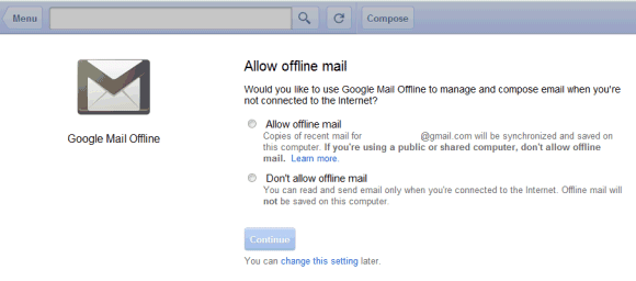
As promised, Google brought back the offline mode for Gmail, Google Calendar and Google Docs. The updated apps use HTML5 features and no longer require the Gears plugin.
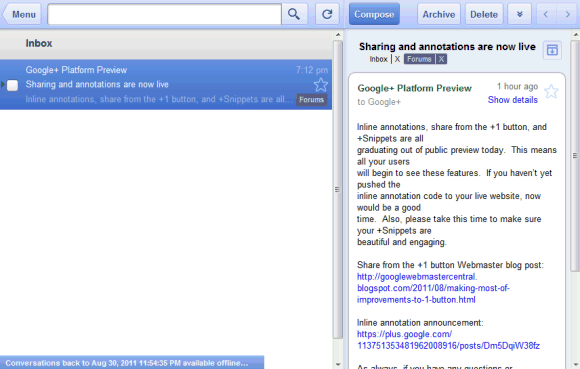
For Gmail, Google chose the easy way out and tweaked the tablet interface. You can only use it in Google Chrome after installing this app from the Chrome Web Store. The app lets you archive and label email, compose new messages and read the messages you've received, but it doesn't have all the features from the standard version. The interface is more suitable for tablets, so this is more like a temporary workaround instead of a definitive solution.
Offline Google Calendar and offline Google Docs aren't yet available to everyone and will be rolled out in the coming days. Google says that the offline mode is built into the apps, just like the Gears version. "Google Calendar and Google Docs let you seamlessly transition between on- and offline modes. When you're offline in Google Calendar, you can view events from your calendars and RSVP to appointments. With Google Docs you can view documents and spreadsheets when you don't have a connection. Offline editing isn't ready yet, but we know it's important to many of you, and we're working hard to make it a reality. To get started using Google Calendar or Google Docs offline, just click the gear icon at the top right corner of the web app and select the option for offline access," explains Google.
I don't see the offline settings for Google Calendar and Google Docs in my account, but offline Gmail is disappointing. It only works in Chrome, it has a different URL (https://mail.google.com/mail/mu/), the interface is optimized for iPad and Android tablets and it's very limited. Hopefully, Google will add support for offline access to the regular interface.
Chrome's Most Important Feature
Posted by R3ank at 2:21 AM 0 comments
Ben Goodger, a former Mozilla developer who now works at Google on the Chrome team, thinks that autoupdate is one of the most important Chrome features.
Chrome automatically updates in the background and makes sure that it always has the latest features and bug fixes. You don't longer have to worry about version numbers, the list of features from the latest release and you can no longer decide that it's a bad idea to upgrade to the new version because of an annoying change. Extensions also update in the background and you're always using the most recent versions. That's a great thing for developers, who don't have to support legacy Chrome versions and spend so much time testing their sites and extensions. It's also a great thing for users, who can rely on a secure browser that has the latest security fixes and it's better protected against malware. They can also use the latest Web apps without having to worry about updating their browser.
Chrome's rapid release cycle works well because of the autoupdater. Annoying users with notifications about the new releases makes people delay updating their browser. Some of them will find ways to disable the updater and will continue to use an old version of the browser. Ben Goodger thinks that making the updater invisible is very important:
I think the autoupdater is the most important Chrome feature because it's the enabler for the other features. Ever since it was released back in 2008, Chrome has constantly improved, supporting new Web technologies, adding new features to the interface, new APIs for extensions and cutting-edge security features. Without a powerful autoupdater, many Chrome users would still have an outdated version and wouldn't be able to use them. Sometimes, removing choice can dramatically improve a software.
{ via François }
Autoupdate is one of Chrome's killer features. It is magical because it continuously updates an entire development platform invisibly, frequently. Supporting it has driven how we structure our development processes. It was also one of Chrome's first features. Delving back into project history long before we launched publicly in 2008, the autoupdate project was one of the very first we started working on. The idea was to give people a blank window with an autoupdater. If they installed that, over time the blank window would grow into a browser. And today, some five years after our autoupdater started updating a mostly blank window that could barely load webpages, it is now an engine for delivering an incredibly sophisticated web technology platform onto our users' computers, which in turn allows web app developers to build amazing new online experiences. I have never seen such an effective platform update mechanism before.
Chrome automatically updates in the background and makes sure that it always has the latest features and bug fixes. You don't longer have to worry about version numbers, the list of features from the latest release and you can no longer decide that it's a bad idea to upgrade to the new version because of an annoying change. Extensions also update in the background and you're always using the most recent versions. That's a great thing for developers, who don't have to support legacy Chrome versions and spend so much time testing their sites and extensions. It's also a great thing for users, who can rely on a secure browser that has the latest security fixes and it's better protected against malware. They can also use the latest Web apps without having to worry about updating their browser.
Chrome's rapid release cycle works well because of the autoupdater. Annoying users with notifications about the new releases makes people delay updating their browser. Some of them will find ways to disable the updater and will continue to use an old version of the browser. Ben Goodger thinks that making the updater invisible is very important:
Chrome's autoupdate system is deceptively simple. I say "deceptively" because as a user it appears completely invisible, but really there are a lot of sophisticated technologies and processes that support it. The key point here is "completely invisible." We have made numerous improvements to the autoupdater over the course of Chrome's life, including one major change a while ago when we sped up the frequency of our releases from once per quarter to one every six weeks. But from a user perspective Chrome is still well.. Chrome.
I'll expand on invisible, because it's important:
The Chrome autoupdater works quietly in the background, never notifying you. If there's an update, it'll download it and prepare it so that the next time you start the browser it's the latest version. Sort of like how the next time you load GMail it's the latest version.
I think the autoupdater is the most important Chrome feature because it's the enabler for the other features. Ever since it was released back in 2008, Chrome has constantly improved, supporting new Web technologies, adding new features to the interface, new APIs for extensions and cutting-edge security features. Without a powerful autoupdater, many Chrome users would still have an outdated version and wouldn't be able to use them. Sometimes, removing choice can dramatically improve a software.
{ via François }
Less is More!
Posted by R3ank at 1:44 AM 0 comments
Morning to you all. Nearly threw the towel in with my Less is More card this week! My card caused me so much grieve! Everything went perfect till I came to the sentiment, hate stamping straight onto the card. Messed up twice so next time I did it the other way round, now why didn't I think of that in the first place!
Would of made life so much easier if I had done this first time round, a
Google +1 Extension for Chrome
Tuesday, August 30, 2011 Posted by R3ank at 10:20 AM 0 comments
Now you no longer have to wait until your favorite site adds a Google +1 button. If you use Chrome, you can install an extension that lets you +1 any Web page. The extension is developed by Google and it acts just like a +1 button: it shows the number of +1's and it becomes blue if you've already +1'd a page.
An obvious privacy trade-off is that the extension sends the list of the pages you visit to Google's servers, but this information is not associated with your account. "Google doesn’t keep a persistent record of your browsing history as part of the process of showing you a +1 button or otherwise use the fact that you personally have visited a page with the +1 button. Google may keep some information about your visit, usually for about two weeks, to maintain and debug its systems," explains Google.
{ Thanks, Kristian. }
Google Trusted Stores
Posted by R3ank at 10:00 AM 0 comments
An unlisted video uploaded to Google's YouTube channel announces a new service for shoppers and sellers: Google Trusted Stores. The program "makes it easy for online shoppers to identify stores that provide an excellent online shopping experience," explains Google. The URL of the new service returns an error message: http://www.google.com/trustedstores, but that's because it wasn't officially launched.
It's likely that Google will show a Trusted Store badge next to the ads for the online stores that provide a great experience and have a good track record of shipping on time and providing excellent customer service.
Right now, Google shows an average rating and a link to user reviews:
Update: The video is now private.
{ Thanks, Ward. }
Kiss Me Quick!
Posted by R3ank at 2:35 AM 0 comments
Hello! Another card, gosh have blogged nearly everyday over the last fortnight, how good it feels to have a clear head and not feel ill everyday. This supplement must be doing something right, just need it to program the energy levels to go soaring through the roof! Well, maybe asking a bit to much there so will settle for a little bit more please lol.
Right on there please lol!
Right, my card
Right on there please lol!
Right, my card
Travel
Monday, August 29, 2011 Posted by R3ank at 8:10 PM 0 comments
A very quick post today with this card. I have used a stamp set from Recollections called Going Places, and the background is a very useful stamp called "Mini Polka Dot Background' that I won from the lovely Jennie at The Artistic Stamper. I would like to enter the following challenges which are all for a travel theme.
http://www.simonsaysstampandshow.blogspot.com/
http://morethanfavors.blogspot.com/
http://thestampmanchallenges.blogspot.com/
http://www.simonsaysstampandshow.blogspot.com/
http://morethanfavors.blogspot.com/
http://thestampmanchallenges.blogspot.com/
New Interface for Google Docs Apps
Posted by R3ank at 2:52 PM 0 comments
Consistency is great, but not when it makes an application more difficult to use. Google Docs tests new interfaces for the document editor and Google Spreadsheets. Inspired by Google+, the new interfaces remove all the colors from the icons and other UI elements, remove the Google Docs logo, add new scrollbars and a "Collaborate" menu that includes all the features from the "Share" drop-down.
The new grayscale buttons from the toolbar make it more difficult to find the right feature. They're are less intuitive, harder to distinguish and look like disabled buttons. Compare the two versions of the "paint format" button (the fifth button):
Unlike the new interfaces for Gmail and Google Calendar, the updated Google Docs apps don't use too much whitespace. You can switch to the new interfaces by clicking "Try now" in a small message that announces the changes when you open a Google Docs document or spreadsheet. To go back to the old UI, choose "Use the classic look" from the "Help" menu.
In other related news, Google Sites also tests a new UI:
{ Thanks, András, Louis, Thomas and Cougar. }
Google Indexes Images a Lot Faster
Posted by R3ank at 9:42 AM 0 comments
Google Image Search used to have an index that wasn't updated too often. At some point, Google started to include images from Google News articles, so you could find images from recent events.
Now Google Image Search's index updates in real-time for many pages, just like the Web Search index. A few minutes after publishing a post, I was really surprised to see that an image from the post was already indexed by Google.
A search for [cartoon] restricted to the past hour returns 41 images and not all of them are from news articles and blog posts. Google Image Search still doesn't index all the images as soon as the pages are indexed by Google, but the improvements are noticeable.
Slide's Apps to Be Discontinued
Posted by R3ank at 9:35 AM 0 comments
One year ago, Google acquired Slide, a company that developed third-party apps for Facebook and other social networks. At that time, Google mentioned that the goal was to "make Google services socially aware". Slide continued to operate as an independent start-up inside Google and developed photo sharing apps like Photovine and Pool Party. Slide's CEO, Max Levchin, became VP of engineering at Google.
New York Times reports that Max Levchin will leave Google and most of the Slide apps will be discontinued. A Slide blog post confirms that "in the coming months, a number of Slide's products and applications will be retired. This includes Slide's products such as Slideshow and SuperPoke! Pets, as well as more recent products such as Photovine, Video Inbox and Pool Party." Slide's team says that "many of these products are no longer as active or haven't caught on as we originally hoped".
A Google spokesperson informed the New York Times that most of the Slide team will continue to work at Google and many engineers will join YouTube. If Slide was a talent acquisition, then why Slide's team didn't work on Google+ and why popular games like SuperPoke weren't ported to Google+?
AllThingsD offers some answers: "Although Slide as an independent start-up had not matched its lofty expectations and valuations — at as much as $500 million in a 2008 funding round — its acquisition brought Google some key assets: Social Web expertise at a time when it was dearly needed, and Levchin, who famously founded PayPal. But that was last August. Since then, Google has entrusted its social efforts to two of its existing executives, Vic Gundotra and Bradley Horowitz, who led the team that created Google+. Levchin was left on the fringes with Slide as an autonomous subsidiary, reporting to Google co-founder Sergey Brin."
Google Calendar Grays Out Old Events
Posted by R3ank at 8:50 AM 0 comments
Google Calendar found a way to separate old events from upcoming events: old events are now grayed out. The interface also grays out future recurring events because it's likely that they're less important (this was an experimental feature in Google Calendar Labs).
If you don't like the new features, it's easy to disable them: go to the "Options" menu from Google Calendar's navigation bar, select "Calendar settings", go to the "Event dimming" section and disable these two options: "Dim past events" and "Dim recurring future events".
Google says that the brightness of these events is reduced "so you can focus on today", although you'll be able to better focus on the future, as well.
{ Thanks, Cougar. }
Keeping Cosy!
Posted by R3ank at 2:18 AM 0 commentsMorning to you all. Nothing for it yesterday but to craft , rained constant and so cold with it, heating on yet again so least I was dry and cosy. Liked the sketch over on pennyblacksaturday and this is what I came up with. Least it helped get another Christmas card done and just loved bringing this gorgeous snowman to life Was on Funkykits site the other day and I see new Christmas stamps are
Chugging Along!
Sunday, August 28, 2011 Posted by R3ank at 3:28 AM 0 comments
Morning to you all, well it's poured here all night, I know cause I was awake most of it. Had a lovely day out yesterday with friends , bought a few crafty things so hopefully have a little play later, like the look of the pennyblacksaturday challenge sketch so who knows, might have a card by the end of the day if I haven't fallen by the wayside with lack of sleep. My card is for my grandson,
Google Sets Will Be Shut Down
Saturday, August 27, 2011 Posted by R3ank at 5:07 AM 0 comments
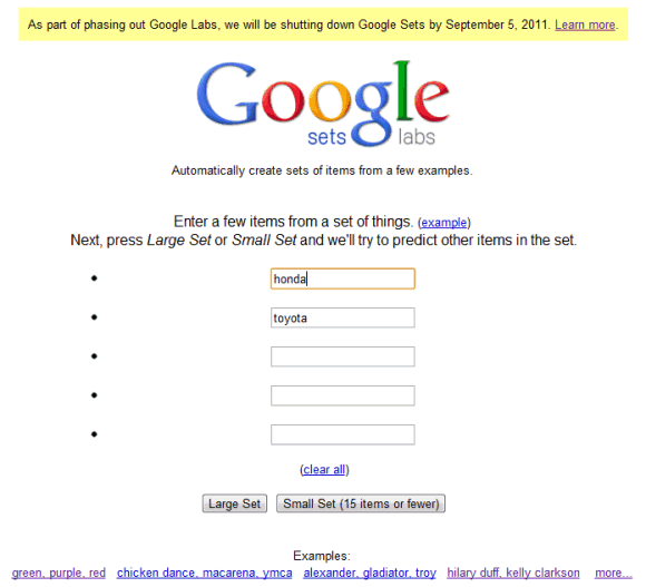
Google Sets, one of my favorite Google Labs experiments, will be shut down on September 5, just like Google Squared. Launched in 2002, Google Sets is the only experiment from the early days of Google Labs that's still available, even though it hasn't graduated.
The great thing about Google Sets is that it only did one thing and did it very well: automatically generating lists from a few examples. Google Sets used the explicit and implicit lists from the pages indexed by Google and tried to find the lists that were relevant to the examples entered by users. For example, you could enter "Honda" and "Toyota" and Google Sets returned a long list of car brands.
The patent filed in 2003 explains that, at that time, there wasn't any "mechanism for quickly and efficiently generating lists of items given one or more example". Web pages included a lot of lists: some of them were created using special HTML tags (<ul>, <ol>, document headers), others used tables, while most of them were items separated by commas or tabs. The patent was filed by Simon Tong, a researcher who contributed to Google's ranking algorithm, designed AdSense's targeting algorithm and Gmail's spam detection's learning algorithm, and Jeff Dean, who designed Google's crawling, indexing, and query serving systems, BigTable and MapReduce, the initial version of Google's advertising serving system and a lot more.
Google Sets was the building block for Google Squared, a service that generated lists and information about the items. If you type "dogs" in Google Squared, you'll see a list of dog breeds, related images, descriptions, the size and the country of origin. The list of dog breeds is now also displayed at the bottom of Google's results page for [dogs]. The attributes aren't yet available in Google Search, but this feature will probably added in the future.
While Google Sets and Google Squared will no longer be available, they're still used in Google Search to better understand the content of a page and to provide lists of related searches.
The great thing about Google Sets is that it only did one thing and did it very well: automatically generating lists from a few examples. Google Sets used the explicit and implicit lists from the pages indexed by Google and tried to find the lists that were relevant to the examples entered by users. For example, you could enter "Honda" and "Toyota" and Google Sets returned a long list of car brands.
The patent filed in 2003 explains that, at that time, there wasn't any "mechanism for quickly and efficiently generating lists of items given one or more example". Web pages included a lot of lists: some of them were created using special HTML tags (<ul>, <ol>, document headers), others used tables, while most of them were items separated by commas or tabs. The patent was filed by Simon Tong, a researcher who contributed to Google's ranking algorithm, designed AdSense's targeting algorithm and Gmail's spam detection's learning algorithm, and Jeff Dean, who designed Google's crawling, indexing, and query serving systems, BigTable and MapReduce, the initial version of Google's advertising serving system and a lot more.
Google Sets was the building block for Google Squared, a service that generated lists and information about the items. If you type "dogs" in Google Squared, you'll see a list of dog breeds, related images, descriptions, the size and the country of origin. The list of dog breeds is now also displayed at the bottom of Google's results page for [dogs]. The attributes aren't yet available in Google Search, but this feature will probably added in the future.
While Google Sets and Google Squared will no longer be available, they're still used in Google Search to better understand the content of a page and to provide lists of related searches.
Bring me Flowers!
Posted by R3ank at 12:10 AM 0 comments
Morning to you all, a very quick post today. Soon be flying out the door to meet up with a couple of crafting friends for a bit of retail therapy. My youngest son Rhys says he'll cook dinner tonight, perfect end to my day. Was looking for a card on my computer and came across this one I made for BTC&G's challenge last month and never got it posted, shame not to blog her! By the way, still time
Creating a Google Account Requires to Enter Your Birthday
Friday, August 26, 2011 Posted by R3ank at 9:30 AM 0 comments
Last year, I reported that creating a Google account requires entering your birthday if you are in the US. It seems that this requirement is no longer limited to the US and changing your location can't be used as a workaround.
If you're younger than 13 years old and you enter your real birthday, you'll see this message: "Google could not create your account. In order to have a Google Account, you must meet certain age requirements. To learn more about online child safety, visit the Federal Trade Commission's website."
Children's Online Privacy Protection Act makes it difficult to collect personal information from children under 13, so that's probably the reason why Google decided to prevent these users to create an account. For example, Google would have to "obtain verifiable parental consent from the child's parent." That's not the case when your school created a Google Apps account for you, since the school has to obtain parental consent.
It's interesting that you can't edit your birthday from your account and that Google deletes the accounts of the children under 13, unless they provide a way to show that the birthday is incorrect. From Google's FAQ:
Creating a Google account is more and more complicated. Sometimes Google will ask to enter your phone number in order to confirm that you're actually a human (and not a bot) and now you also need to enter your birthday. Some services require to create a Google Profile and if you want to use Google+, you need to use your real name or "the name your friends, family or co-workers usually call you". If something goes wrong, you'll have to prove that it's your name.
{ Thanks, Herin. }
If you're younger than 13 years old and you enter your real birthday, you'll see this message: "Google could not create your account. In order to have a Google Account, you must meet certain age requirements. To learn more about online child safety, visit the Federal Trade Commission's website."
Children's Online Privacy Protection Act makes it difficult to collect personal information from children under 13, so that's probably the reason why Google decided to prevent these users to create an account. For example, Google would have to "obtain verifiable parental consent from the child's parent." That's not the case when your school created a Google Apps account for you, since the school has to obtain parental consent.
It's interesting that you can't edit your birthday from your account and that Google deletes the accounts of the children under 13, unless they provide a way to show that the birthday is incorrect. From Google's FAQ:
You can re-enable your account by following our instructions to confirm that you are old enough to have a Google Account. You will see these instructions when you attempt to sign back in to your account. We currently offer two ways to confirm your age:
1. Sending in a signed form via mail or fax with a copy of your current, government-issued ID showing your date of birth, or
2. Performing a small transaction ($0.30 USD) on a valid credit card.
Creating a Google account is more and more complicated. Sometimes Google will ask to enter your phone number in order to confirm that you're actually a human (and not a bot) and now you also need to enter your birthday. Some services require to create a Google Profile and if you want to use Google+, you need to use your real name or "the name your friends, family or co-workers usually call you". If something goes wrong, you'll have to prove that it's your name.
{ Thanks, Herin. }
Mirror Mirror!!
Posted by R3ank at 2:31 AM 0 comments
Morning, weekend's come round so fast once again, been a busy week making cards, feels great I can tell you. Thankyou everyone for there lovely comments, great to be able to blog hop and pick up inspiration from others and is rather lovely when a fellow blogger gleams some from you! No grandchildren this weekend, they're sunning it up in Majorca, so a little craft shopping therapy I think is
Less is More Things That Move
Thursday, August 25, 2011 Posted by R3ank at 1:13 AM 0 comments
Morning, a bit dull here today, just hope it brightens up as the day goes on! A Less is More card today from me and this week, Chrissie and Mandi would like to seeThings That Move! Really like the TH weather clock and along with the Hero Arts Live Life sentiment this is what I created. And since I failed miserably with last weeks challenge, yes I didn't take on board the Inky challenge, brain
Lists in Google Snippets
Wednesday, August 24, 2011 Posted by R3ank at 2:36 PM 0 comments
I've mentioned two weeks ago that Google started to label pages that include search results. For some of these pages, Google's snippets now use lists, so you can distinguish between separate items. These snippets are twice as big as the regular snippets (4 lines vs 2 lines) and they include useful information like prices or dates.
Sometimes Google is confused and shows similar snippets for blogs, especially if homepages look like search results pages.
Google's snippets usually include one or more excerpts from the page that include some of your keywords and are separated by ellipses.
Update: It's official. "If a search result consists mostly of a structured list, like a table or series of bullets, we'll show a list of three relevant rows or items underneath the result in a bulleted format. The snippet will also show an approximate count of the total number of rows or items on the page," explains Google.
Bart's BBQ
Posted by R3ank at 12:33 PM 0 comments
Isn't he just the cutest? I won this stamp recently from Chrissy Armstrong, and this is the first chance I have been able to colour him up with my new copics. I have followed the sketch at Sketch Saturday. The background papers are from my stash.
I would like to enter the following challenges.
http://craftycreationschallenges.blogspot.com/ - show us your wild side
http://sketchsaturday.blogspot.com/ - sketch #169
http://www.vostamps.blogspot.com/ -summer
http://herecometheboysblogchallenge.blogspot.com/ -brown and orange
http://letscreatechallenges.blogspot.com/ -teddy bears or picnic (is a BBQ a picnic?)
Short URLs, Back in Google Maps
Posted by R3ank at 1:17 AM 0 comments
After a brief disappearance, short URLs are back in Google Maps. This was one of the most popular experiment from Google Maps Labs and it's now a standard feature. Just click the link button next to the search box and click the "short URL" checkbox. The new short URLs use g.co, a domain recently acquired by Google. All the URLs that start with "http://g.co" send you to Google domains, while http://goo.gl/ continues to be a public URL shortener.
Google Maps is the service that generates very long URLs with many unnecessary parameters, so the short URLs are useful not just for posting a Twitter message or sending a text message, but also for writing an email, a comment on a blog post or for adding a Google Maps URL to a document. Google Maps also needs to automatically change the URL from the address bar, so that you don't have to use the permalink button.
{ via Google LatLong }
Happy Days!!
Posted by R3ank at 12:58 AM 0 comments
Morning, another beautiful day here. After yesterdays post, Kath wondered if I was on happy pills!! Well Kath and maybe any M.E./Fybromyalgia sufferers out there, could this be the answer to my prayers! Early days and don't want to get my hopes up to much but trying a supplement. My son came across it on the net, a common ingredient used in cough mixtures but also used for other things. This doc
Starting the day off!!
Tuesday, August 23, 2011 Posted by R3ank at 3:36 AM 0 comments
Kath's card
Morning folks, a lovely day here and a lovely start to my day! My Tree card has appeared on Craftworks blog this morning Woo hoo. Down to the lovely Kath I must say....email Julie she said, she would like to see it I'm sure! So that's what I did....a big thank you from me Kath, x.
My card today, well I wasn't sure which one to post first, yes I have a few! Been busy busy but then
Music Rich Snippets in Google Search
Monday, August 22, 2011 Posted by R3ank at 11:50 AM 0 comments
Last week, Google announced a new flavor of rich snippets, this time for music pages. At that time, I couldn't see the new snippets, but now they should be available for everyone.
"With this new feature, site owners can mark up their pages using the newly created music markup spec on schema.org, and search results for that site may start displaying song information in the snippet so that users know that there are songs or samples there for them to listen to. Several initial partners have implemented the music markup on their sites, including MySpace, Rhapsody and ReverbNation," explained Google.
The new rich snippets include links to music pages that could be found by visiting the search result, but it's faster to bypass the search result and start to play a song. It's important to mention that the songs aren't played on Google's results pages, so you still need to go to a different page. You'll only see the music rich snippets when your query includes the name of an artist, a song or an album.
Google also shows rich snippets for events, profile pages, recipes, videos, reviews and products. "With rich snippets, webmasters with sites containing structured content—such as review sites or business listings—can label their content to make it clear that each labeled piece of text represents a certain type of data: for example, a restaurant name, an address, or a rating."
At some point, Google will make structured data searchable and it will be a lot easier to refine results. Recipe search already lets you do that and it's pretty useful.
Zesty Girl!
Posted by R3ank at 1:44 AM 0 comments
Morning folks, hope you had a good weekend, I was babysitting my grandkids. Don't know who was more tired by bedtime and it seemed like I had no sooner hit the pillow and they were there telling me it was time to get up Nana....groan....why do they have to get up so early!
Having another play with Candy Pip from Sugar Nellie, inked her up with black Memento, stamped on SU card. Paper played her
You are my Sunshine!
Sunday, August 21, 2011 Posted by R3ank at 4:44 AM 0 comments
Afternoon folks. Not posted a card for a couple of days but haven't been idle.....looked out papers to make a card and ended up making three layouts with papers long forgotton about in the cupboard. This card is using Forever Friends Pink Parfait papers. Did at one point think it was going in the bin! Eyesight playing funny tricks today, nothing looked straight or evenly distributed, gawd so
How to Try Google's Cleaner Interface
Friday, August 19, 2011 Posted by R3ank at 8:17 AM 0 comments
I mentioned in the previous post that Google tests a less cluttered interface and there's now a way to try it. Techno-Net noticed that you can change the NID value of a Google cookie and get the same interface.
Here's how to do this in Chrome:
1. Install "Edit this Cookie", a cookie manager for Chrome.
2. Go to Google's homepage and click the yellow cookie icon from Chrome's toolbar.
3. Find the line that starts with NID, click it, select the value (Ctrl-A or Command-A for Mac), delete it, paste the following value (use Ctrl-V or Command-V for Mac) and click "Submit cookie changes":
Here are the instructions for Firefox:
1. Install Cookies Manager+ and restart the browser.
2. Go to Google's homepage.
3. Press Alt-T and select "Cookies Manager+". You'll also find the option in the "Web Developer" item of Firefox's unified menu.
4. Search for google.com and find the entry named "NID". If you're not in the US and you use a different Google domain, search for your domain (for example: google.co.uk in the UK).
5. Click "edit" and replace the content with:
Opera already has a cookie manager that lets you edit cookie values. You only need to go to Google's homepage, right-click on the page, select "Edit site preferences", go to the "Cookies" tab and edit the item that starts with "NID".
I couldn't find some great cookie managers that worked in the latest versions of Internet Explorer and Safari, but the instructions should be similar.
Sharing the "NID" value allows other people to try an experimental Google interface. The next time when you find an interface that looks different and you send a tip to gostips@gmail.com, you can also include the NID value of your Google cookie.
If Google constantly changes the "NID" value and you can't use the experimental interface for too long, delete your Google cookies and start again. What if you don't like the interface and you want to go back to the regular UI? Just remove the "NID" key or delete its value using the cookie manager.
Google Tests a Cleaner Interface
Thursday, August 18, 2011 Posted by R3ank at 12:15 PM 0 comments
Google started to test a variation of the search interface I mentioned the last month. The experimental interface removes all the icons from the sidebar and the icons for Google +1 and Instant Preview, which are displayed next to the results.
When you mouse over a search result, Google shows a bigger Instant Preview icon in a vertical bar. Mouse over the bar, and you'll a large screenshot of the page, the links to the cached paged and other similar pages and the Google +1 button.
Like the previous variation of the experiment, Google's header and the search options sidebar are sticky, so you'll see them even if you scroll down. It's the perfect interface for implementing infinite scrolling, which is also tested in a separate experiment.
{ Thanks, Herin. }
Google Chrome Adds Support for Native Client Apps
Posted by R3ank at 11:37 AM 0 comments
Almost three years after its announcement, Native Client is almost ready for prime time. It's enabled in Chrome 14, which is now in beta and will reach the stable channel in less than a month.
Native Client is a very complex framework that allows browsers to run native compiled code in a sandbox. Google's goal is to "maintain the OS portability and safety that people expect from web apps", while allowing developers to use their preferred language. Right now, the only supported languages are C and C++ and Native Client only works in Chrome for Windows, Mac and Linux.
"Native Client apps live on the web platform, so you don't need to create separate versions of your app for each operating system. Rather than relying on OS-specific APIs, Native Client apps use Pepper, a set of interfaces that provide C and C++ bindings to the capabilities of HTML5. This means that once you've ported your code to Native Client, it will work across different operating systems, and you only need to maintain one code base. Today Native Client supports the Pepper APIs for 2D graphics, stereo audio, URL fetching, sandboxed local file access (File API), and asynchronous message passing to and from JavaScript. In future releases we will be adding support for hardware accelerated 3D graphics (OpenGL ES 2.0), fullscreen mode, networking (WebSockets and peer-to-peer connections), and much more," informs Google.
Google announced that developers will be able to upload their native apps to the Chrome Web Store once Chrome 14 hits the stable channel. In the meantime, Chrome 14 users can try the examples from this gallery: a pi generator, a sine wave synthesizer and John Conway's Game of Life.
NaCl (Native Client) + Pepper -> a lot of games, business apps, educational apps, image editors and virtual machine software running inside your browser. Suddenly, Chromebooks are no longer that limited.
Audio Pronunciation in Google Search
Posted by R3ank at 10:48 AM 0 comments
Google added a new feature to the dictionary OneBox: audio pronunciation. This feature was available if you clicked "More" to read all the definitions, but now it's more accessible.
Google uses Flash to play the audio file, so the feature doesn't work if you disable Flash. It's interesting that Google shows the audio icon if you use an iPad, even though the device doesn't let you install the Flash plugin. The HTML5 audio tag is a better option for iOS devices and for the browsers that support it.
Weather Layer in Google Maps
Posted by R3ank at 9:54 AM 0 comments
Google Maps added a layer for weather. Just mouse over the satellite box and select "weather" from the list of layers.
"When zoomed out, you'll see a map with current weather conditions from U.S. Naval Research Lab. And, if you look closely, you can also tell if it's day or night around the world by sun and moon icons. Enabling the weather layer also gives you an instant weather report for friends and family living around the world," informs Google. Weather reports are powered by weather.com and include information about the current conditions (humidity, wind speed, temperature) and a 4-day forecast.
The nice thing about Google Maps layers is that you can combine them. For example, you can enable both the terrain and the weather layers, like you can see in the screenshot above.
Google Tests Infinite Scrolling for Search Results Pages
Wednesday, August 17, 2011 Posted by R3ank at 7:36 AM 0 comments
After testing a persistent header, Google continues to experiment with infinite scrolling for Google search results. A Webmaster World user spotted a new box that replaces the standard pagination links: "show more results". When you click the message, Google loads the second page of results below the top results.
Barry Schwartz says that Google tested a similar interface back in June. I remember that SearchMash, Google's old playground for search experiments, used infinite scrolling in the first iterations. Last year, Google Image Search added infinite scrolling,
There are many extensions that add infinite scrolling to Google search results pages. One of the best is AutoPager, which is available for Firefox and Chrome.
Gmail's Newest/Oldest Pagination Features
Posted by R3ank at 6:40 AM 0 comments
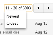
The latest Gmail design refresh replaced pagination links with arrow buttons. Even if it's not obvious, the navigation links that sent you to the newest/oldest messages are still available in the new interface. Just click the message similar to "11-20 of 3903" from the screenshot below and you'll see the two options that appeared to be missing.
This works for Gmail's search results and when you click one of the labels. For example, you can go to the "All Mail" system label, click the pagination message, select "Oldest" and find the first messages from your Gmail account.
For the search terms that return a lot of results, the only pagination feature that works is "newest" because Gmail shows vague estimations for the number of results like "1-20 of hundreds" or "1-20 of thousands" and it can't determine the last page of results.
{ Thanks, jpp. }
Undocumented Shortcut for Caps Lock in Chrome OS
Posted by R3ank at 3:02 AM 0 comments
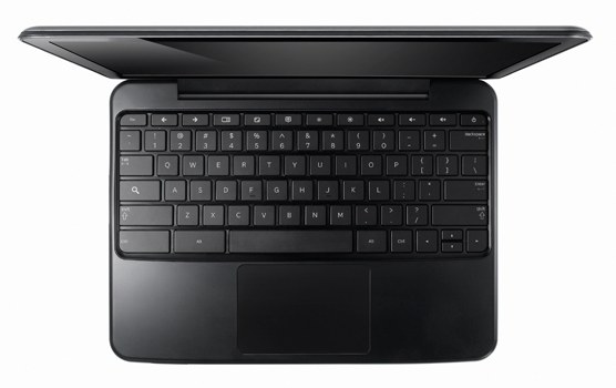
One of the most important changes Google made when designing the keyboard for Chrome OS notebooks was replacing the Caps Lock key with a search key. While the search key is not very useful since it only opens a new tab, the Caps Lock key made a lot of comments, forum threads and emails unreadable.
If you really need to use the Caps Lock key, there's a way to change the search key into a Caps Lock key in the settings. Unfortunately, this is time consuming, especially if you constantly switch between the search key and the Caps Lock key. There's a better way: press both Shift keys at the same time to enable or disable Caps Lock. It's an undocumented shortcut that works in the latest versions of Chrome OS.
{ Thanks, Cougar. }
Google Related for Chrome
Tuesday, August 16, 2011 Posted by R3ank at 11:56 AM 0 comments
Launched as a Google Toolbar feature last month, Google Related is now available for Chrome. "Google Related works in the background to find you the most interesting and relevant content on the topics you're currently viewing. For example, if you visit a restaurant's website, Related can show you a map, reviews from Google Places, mentions from across the web and other similar eateries that you might want to try," informs Google.
Google Related is a good opportunity for Google to track all the pages you visit and to offer something useful in return. After all, Google Related is a lot more useful than the PageRank button from Google Toolbar or Internet Explorer's Suggested Sites feature.
The bar is displayed at the bottom of the window, but not for all the pages. If there's not enough information related to the page, you won't see the bar. For example, Google Related is not displayed when you visit CNN's homepage, but it's displayed when you go to a CNN article. Another great thing about Google Related is that it shows various types of content, depending of the page you're visiting. Sometimes you'll see news articles and images, for other pages you'll find maps, local results and in other cases you'll see videos that play without leaving the page.
Google Related would be even better if you could see the related content on-demand (for example, by clicking a button). This way, you would no longer send your browsing history to Google and Google would get less information, so it's quite obvious why Google didn't add this option. Hopefully, Google will release an API for Google Related and other developers will create better extensions and widgets.
Update. Here an interesting quote from the book "I'm Feeling Lucky" by Douglas Edwards, who was Google's director of consumer marketing and brand management until 2005:
{ Thanks, Herin. }
Google Related is a good opportunity for Google to track all the pages you visit and to offer something useful in return. After all, Google Related is a lot more useful than the PageRank button from Google Toolbar or Internet Explorer's Suggested Sites feature.
The bar is displayed at the bottom of the window, but not for all the pages. If there's not enough information related to the page, you won't see the bar. For example, Google Related is not displayed when you visit CNN's homepage, but it's displayed when you go to a CNN article. Another great thing about Google Related is that it shows various types of content, depending of the page you're visiting. Sometimes you'll see news articles and images, for other pages you'll find maps, local results and in other cases you'll see videos that play without leaving the page.
Google Related would be even better if you could see the related content on-demand (for example, by clicking a button). This way, you would no longer send your browsing history to Google and Google would get less information, so it's quite obvious why Google didn't add this option. Hopefully, Google will release an API for Google Related and other developers will create better extensions and widgets.
Update. Here an interesting quote from the book "I'm Feeling Lucky" by Douglas Edwards, who was Google's director of consumer marketing and brand management until 2005:
To tell you the PageRank of a site, Google needed to know what site you were visiting. The Toolbar sent that data back to Google if you let it, and Google would show you the green bar. The key was "if you let it," because you could also download a version of the toolbar that would not send any data back to Google. The user could make the choice, though Larry and the engineering team believed — and hoped — that most people wouldn't pass up the advanced features just because Google might learn their surfing habits. We're talking free extra data here. While knowing the PageRank of a page might have only nominal value to users, knowing the sites users visited would he tremendously valuable to Google. The PageRank indicator provided a justification for gathering it.
{ Thanks, Herin. }
Google Catalogs Returns
Posted by R3ank at 11:21 AM 0 comments
Two and a half years after discontinuing Google Catalogs, the service returns as an app for tablets. "The Google Catalogs app features digital versions of catalogs across many popular categories, including fashion and apparel, beauty, jewelry, home, kids and gifts," explains Google.
Right now, the app is only available for iPad, but Google promises to release an app for Android tablets soon. You can find catalogs from stores like Neiman Marcus, Macy's, Sephora, Bergdorf Goodman, Nordstrom and a few others. The application lets you find information about products, buy them, add them to favorites or to collections. For some of the products, you can watch videos or view photo albums. If you like one of the catalogs, add it to favorites and you'll get notifications when new issues arrive.
While the list of catalogs isn't impressive, Google says that it will continually add new catalogs. There's even a form for merchants.
{ Thanks, Herin. }
Just a Country Girl at Heart!
Posted by R3ank at 8:12 AM 0 commentsA card just for me! Back using the Pennyblack star dance image with a slight twist! Turned it into a country style wreath....inked with TH Walnut stain and decorated with butterflies and pearls.
http://papertakeweekly.blogspot.com/ - Bingo - Buttons Ribbon Free
http://ladybugscraftsinkchallengeblog.blogspot.com/ - Favourite stamp
x
New Google Movies OneBox
Monday, August 15, 2011 Posted by R3ank at 2:49 PM 0 comments
Google's OneBox for movie showtimes has a new interface that offers information about more movies. It's much easier to compare movies and you can click "show more movies" to expand the OneBox. Google links to the Google Movies site, which shows short snippets from reviews, trailers, small photos, but also links to IMDb.
Here's the old OneBox:
In other related news, François Beaufort spotted that the Google.com sprite, which includes all the images that are used in the search results pages, added 4 icons for flight search, music search and movie search. Back in March, TechCrunch noticed that the music search feature no longer worked. "The music search feature introduced in 2009 is currently unavailable while we make some updates to the user experience," explained Google.
{ Thanks, Surat. }
Subscribe to:
Posts (Atom)