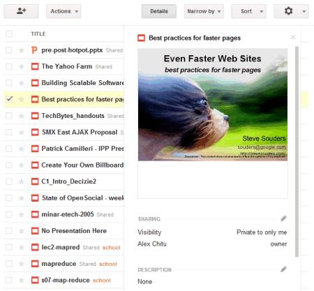


Another change is that the details pane is no longer a sidebar. If you want to find more information about a document, select it and click "Details". Google Docs will display an overlay that includes a large thumbnail, sharing information, the list of collections where you placed the document and some other information.

There's also a button for sharing the selected documents and some new icons for documents, spreadsheets, drawings, presentation and other files.
{ Thanks, Tom. }


0 comments:
Post a Comment