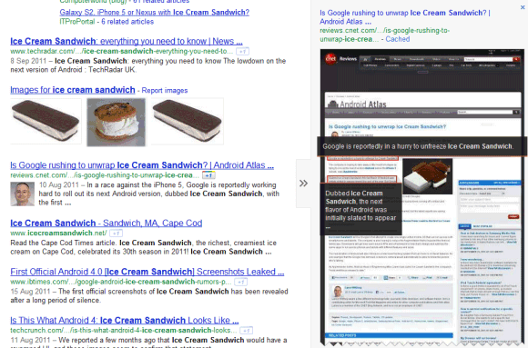
"Instant Previews have been around since last year, allowing you to click on the magnifying glass to the right of the result to see a visual overview of a page. Now these previews are no longer even a click away: if you move your mouse over a search result, arrows will appear. Hover over them to see a visual preview of that result," explains Google.
Clicking the snippet no longer triggers an Instant Preview in the new interface. Unfortunately, the keyboard shortcut has been disabled, so you can longer get a glimpse of the page using the right arrow.
Google now repeats the title of the page and the URL next to the screenshot, while the links to the cached page and to other similar pages are included in the new enlarged snippet. It's a bad news for those who frequently use the "cache" link, who now have to spend more time to find it.
The only action that's still displayed is the Google +1 button, but you need to log in to see it. Probably Google wanted to emphasize the button, which is now placed next to the URL.
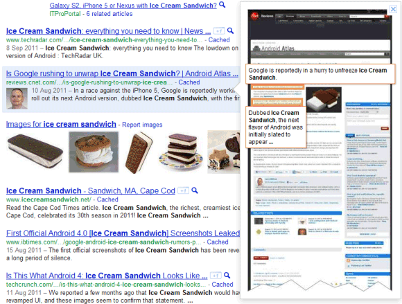
Here's the old interface:


0 comments:
Post a Comment