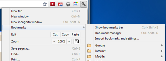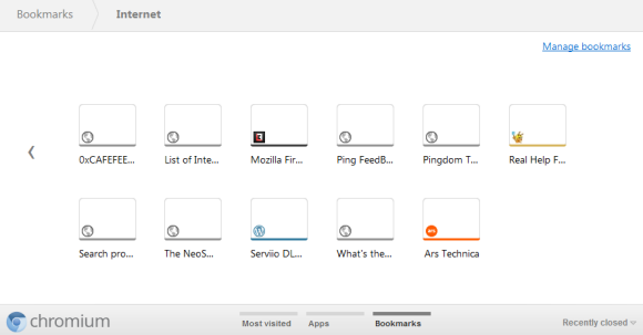
The new tab page no longer includes the bookmarks bar if this feature is disabled. The main reason for removing the bar is that the new tab page now includes a special section for bookmarks, next to the sections for apps and frequently visited pages. Bookmarks are displayed just like apps, but the thumbnails are much smaller and they seem to be blank, at least for now. You can now drag bookmarks to the list of apps, reorder them or remove them without using the bookmark manager.

While there are many advantages to the new interface for browsing and managing bookmarks, the thumbnail view is not very useful if you have a lot of bookmarks in a folder. Page titles are truncated to the first 10-15 characters and it's not always easy to find a bookmark. A list view is more space-efficient.


0 comments:
Post a Comment